cross-posted from: https://lemmy.world/post/18796438
Spotted by: https://www.soeren-hentzschel.at/mozilla/exklusiv-sehen-wir-hier-das-neue-mozilla-logo/
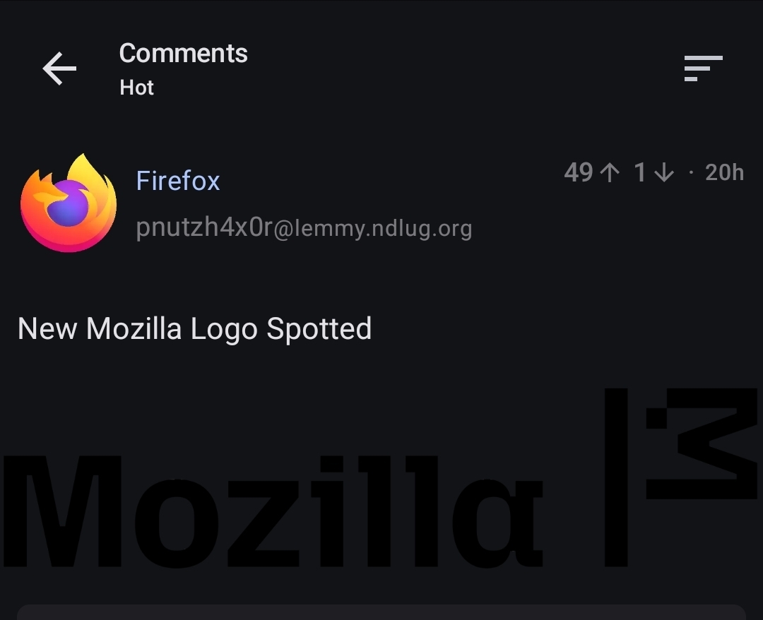
Related Article: Mozilla’s New Logo Brings Back the Dinosaur Mascot (Kinda)

A place to discuss the news and latest developments on the open-source browser Firefox.
1. Adhere to the instance rules
2. Be kind to one another
3. Communicate in a civil manner
If you would like to bring an issue to the moderators attention, please use the "Create Report" feature on the offending comment or post and it will be reviewed as time allows.
cross-posted from: https://lemmy.world/post/18796438
Spotted by: https://www.soeren-hentzschel.at/mozilla/exklusiv-sehen-wir-hier-das-neue-mozilla-logo/
Related Article: Mozilla’s New Logo Brings Back the Dinosaur Mascot (Kinda)
I much preferred the moz://a logo, its such a clever concept for a web company
Are they just... waving a white flag as if they surrender?
I kinda like the current Moz://a logo.
It's transparent. Probably shouldn't be
Is this an early or late April Fools?
        _
      _(·)<
      \__)
that the new duckduckgo logo?
Yes, for their lynx fork.
Thanks I hate it.
Not claiming your opinion would be wrong. But I honestly don't know why one would hate it (not joking if it sounds like :D) .
I much preferred the moz://a logo, its such a clever concept for a web company
i really liked the old :// part in the logo. I even made a post here based on it earlier.
Holy cow, what an ugly font.
Bring back red dinosaur! /s
What font is it? Not the Fira nor Fira Code.