this post was submitted on 21 Oct 2023
432 points (98.2% liked)
Data Is Beautiful
8209 readers
1 users here now
A place to share and discuss data visualizations. #dataviz
founded 4 years ago
MODERATORS
you are viewing a single comment's thread
view the rest of the comments
view the rest of the comments
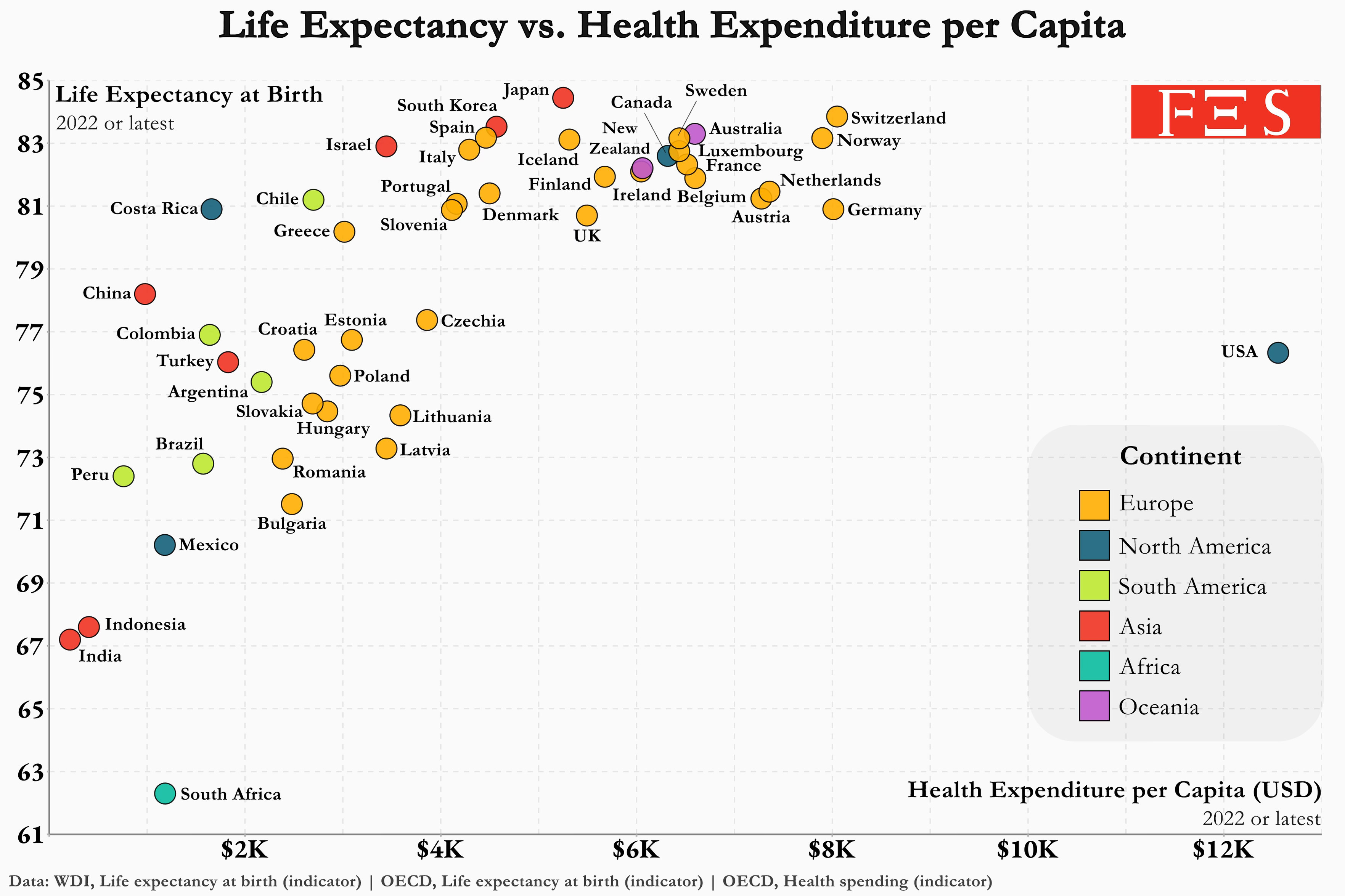
Would the graph look slight more narrow if we accounted for median or average country income? Me spending 12k dollars a year in the us is very different than in Mexico, depending on where I get me income from.