this post was submitted on 01 Sep 2023
325 points (100.0% liked)
196
16822 readers
858 users here now
Be sure to follow the rule before you head out.
Rule: You must post before you leave.
If you have any questions, feel free to contact us on our matrix channel.
founded 2 years ago
MODERATORS
you are viewing a single comment's thread
view the rest of the comments
view the rest of the comments
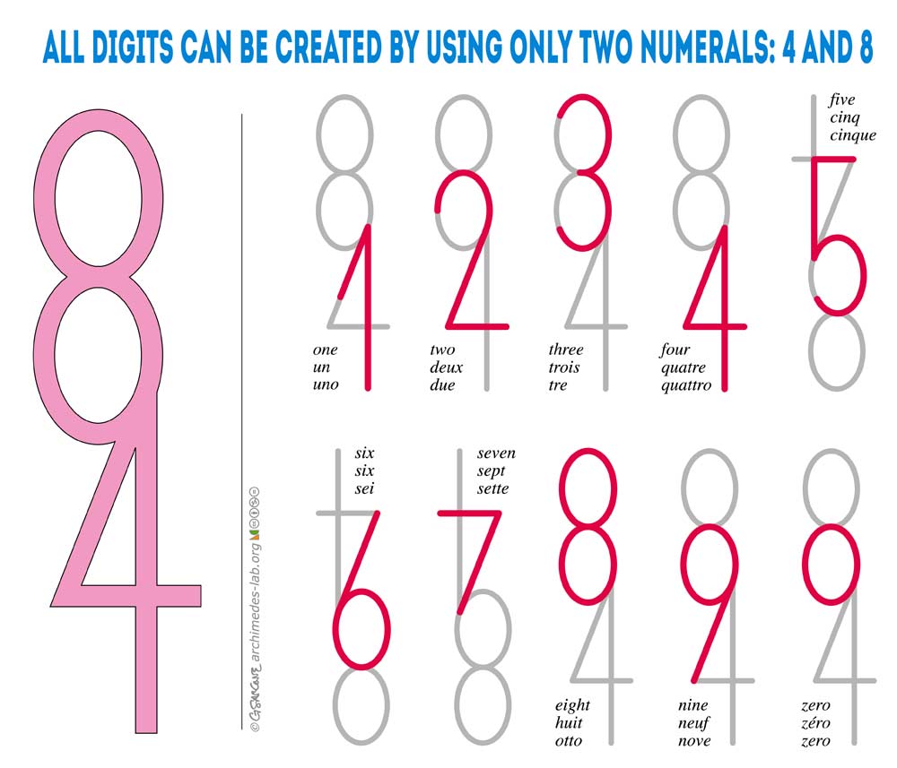
I argue that when presented with 9 normal looking numbers, the o is not an acceptable alternative to 0
So many fonts just do whatever to be different and stand out from the crowd, but all it does is making it easier to avoid them
It just looks like a lowercase 0. Lowercase digits often look better anyway.
what
Look up lowercase digits in your typography manual and be enlightened. And also start making nicer documents.