This is one of the characters from Valandar's second Player Character pack. His weapon made me think of mer-people, so I wanted to paint this guy with an aquatic theme. About halfway through I realized the color scheme wasn't going in the direction I wanted, so I abandoned the aquatic theme and just picked colors that I thought would look good together.
After applying the final wash, I felt the model looked too dark and monotone, so I decided now was a good time to give edge highlighting a try, something I've always been too lazy or impatient to try. Holy crap, does a tiny bit of white make a difference! You can see that my blending and edge selection leaves plenty to be desired, but for a first time, I think some parts of his robe look really cool.
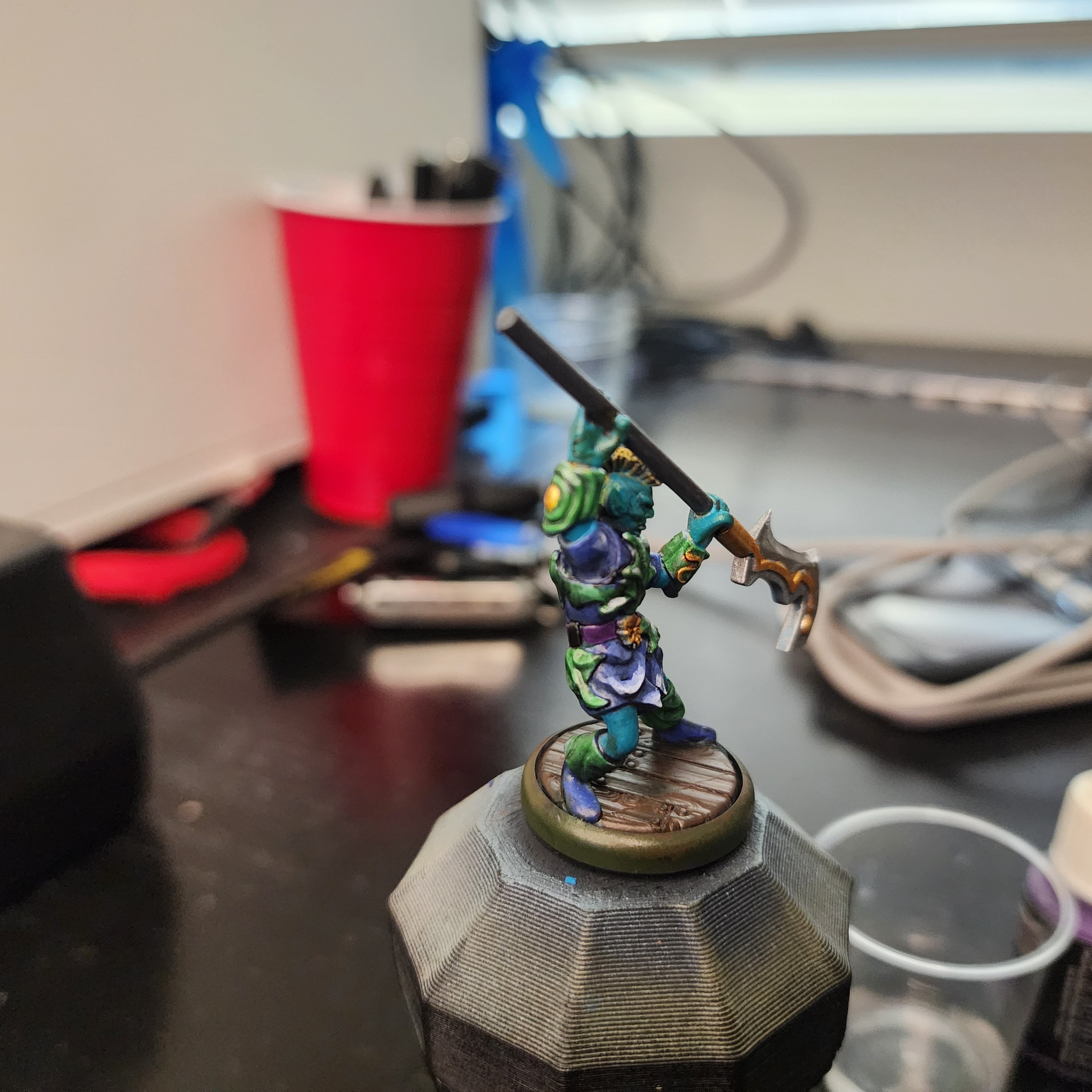
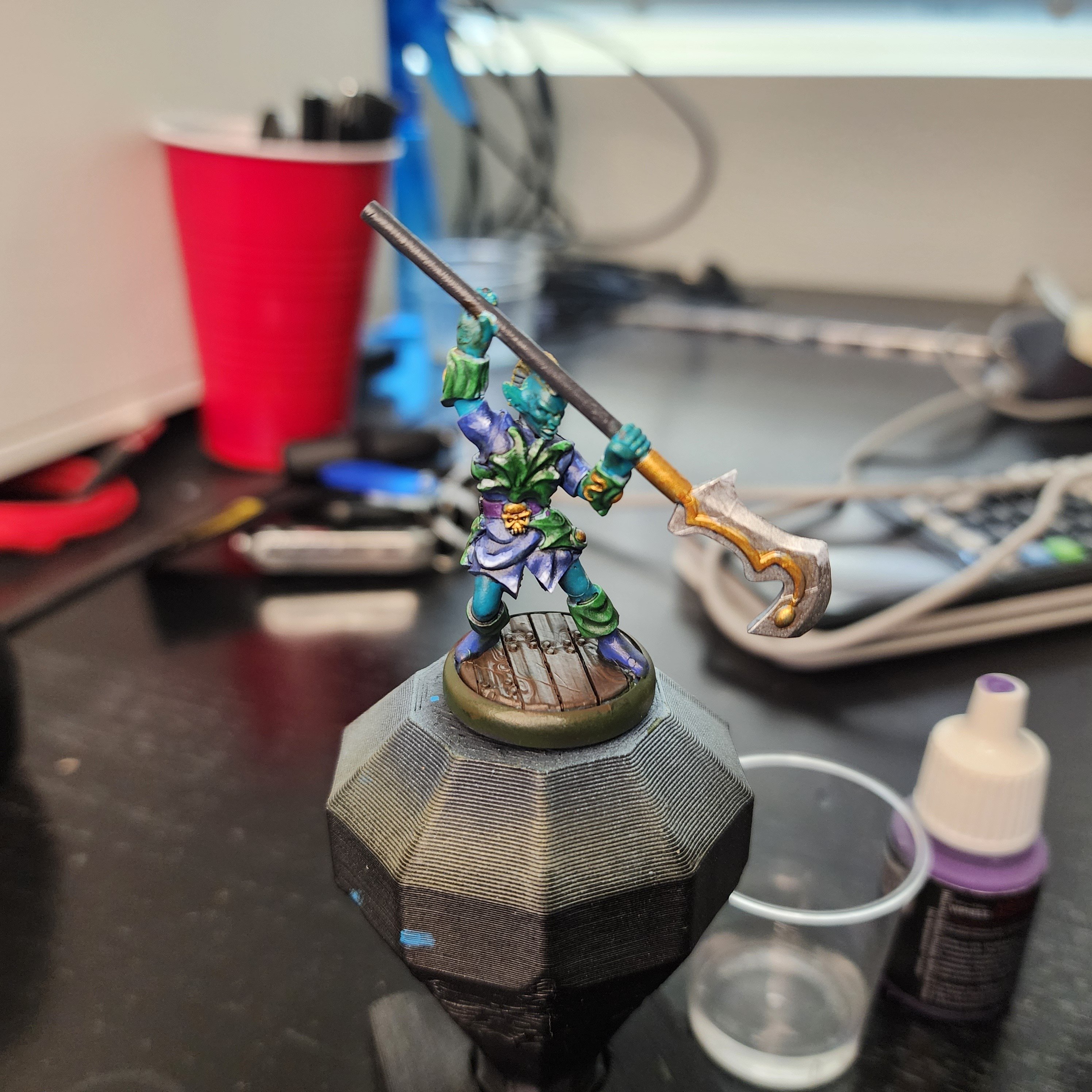
As always, here are a few more angles:
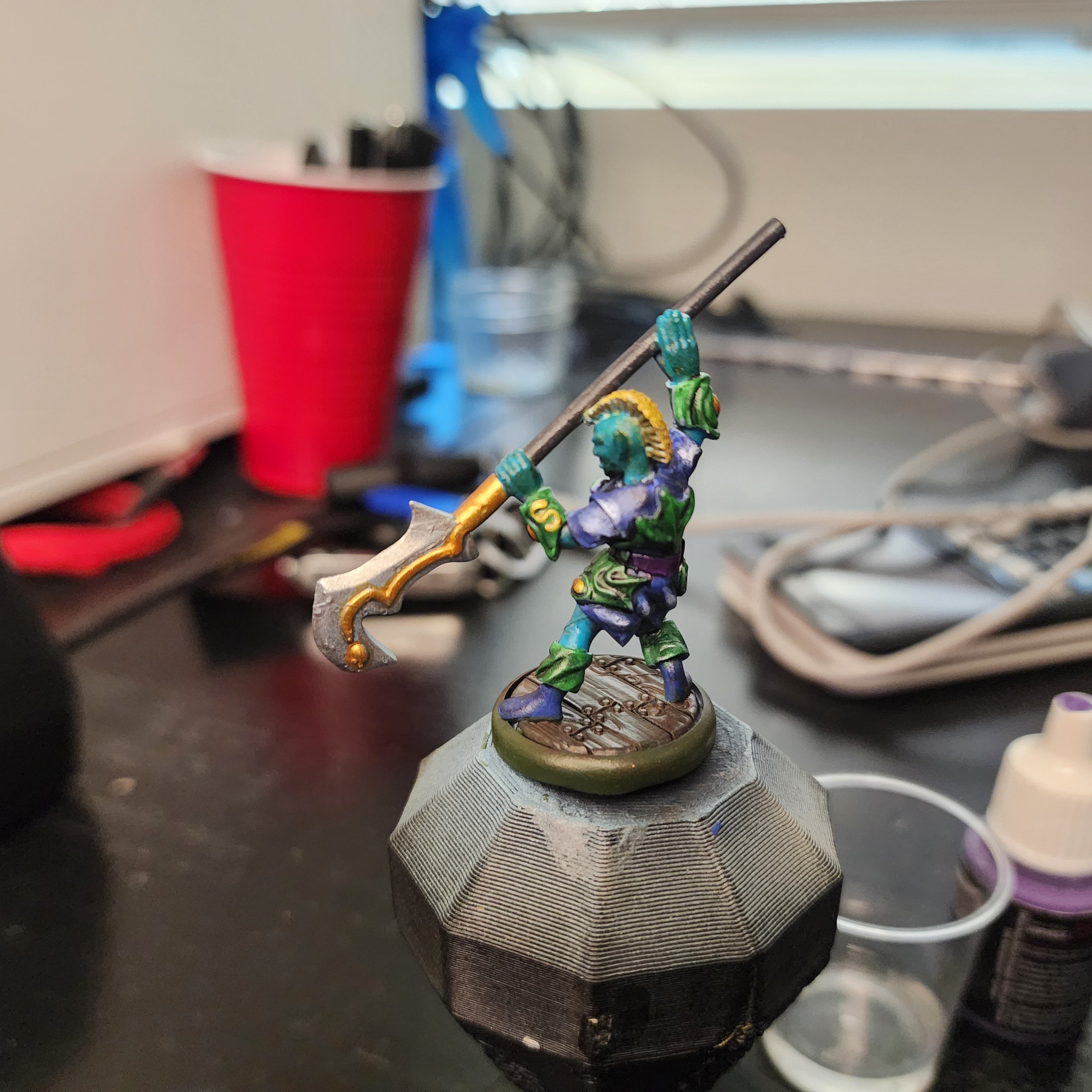
If anyone has any advice or pointers for color selection, I'm all ears. For this guy, I started with the color I knew I wanted to make a bulk of the model (blue/ aquamarine), picked a few nearby colors (green and purple) for the secondary bits, then jumped across the color wheel (yellow and gold) for the highlights. I think the model has good contrast, and the colors look ok together, it just doesn't have the look I was going for. I'm sure I'll get a better eye for color selection as I continue to paint, but if there are any places to start looking I'm open to pointers.
Thank you! A bit of advice that has stuck in my head re: highlights is, always take it one step further than you think you need to; if you think the 3rd shade lighter looks good, 4 will look great, 5 will be too much.
I was happy at around layer 4 for the front, so I started bringing some bits to almost pure white. I don't know if pure white was too bright, if I didn't thin it enough, or if I started getting sloppy with my brush strokes, but those pure white spots were so distracting to me that I just skipped the last highlight on his back.
I wanted to challenge myself to not copy a premade color scheme, aiming to create my own to hone my eye. After this, I think it's a little too early for me to try to make my own pallets entirely from scratch for all of my figures, but for random minis and throwaway figurines that I don't have any attachment to, well, I think it looks better than it did in gray!
Your Pikachu example has me wanting to paint something in that color scheme, though. I'm picturing a dark golden brown cape with a bright gold fringe and yellow underside. Normal iron/ silver armor, but with yellow highlights, and a yellow skirt, some ruby red studs, a traces of black detailing here and there. He might even have a trident with electric arcs between the poky bits.