this post was submitted on 23 Jul 2023
318 points (92.3% liked)
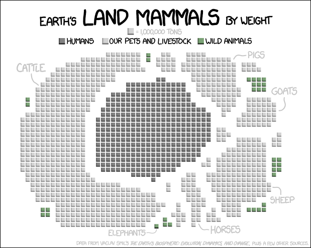
Data Is Beautiful
7937 readers
1 users here now
A place to share and discuss data visualizations. #dataviz
founded 4 years ago
MODERATORS
you are viewing a single comment's thread
view the rest of the comments
view the rest of the comments
A bit confusing. Normal circumferences or a bar graph would be much more informative and easier to compare.