All day
Jerboa
Jerboa is a native-android client for Lemmy, built using the native android framework, Jetpack Compose.
Warning: You can submit issues, but between Lemmy and lemmy-ui, I probably won't have too much time to work on them. Learn jetpack compose like I did if you want to help make this app better.
Built With
Features
- Open source, AGPL License.
Installation / Releases
Support / Donate
Jerboa is made by Lemmy's developers, and is free, open-source software, meaning no advertising, monetizing, or venture capital, ever. Your donations directly support full-time development of the project.
Crypto
- bitcoin:
1Hefs7miXS5ff5Ck5xvmjKjXf5242KzRtK - ethereum:
0x400c96c96acbC6E7B3B43B1dc1BB446540a88A01 - monero:
41taVyY6e1xApqKyMVDRVxJ76sPkfZhALLTjRvVKpaAh2pBd4wv9RgYj1tSPrx8wc6iE1uWUfjtQdTmTy2FGMeChGVKPQuV - cardano:
addr1q858t89l2ym6xmrugjs0af9cslfwvnvsh2xxp6x4dcez7pf5tushkp4wl7zxfhm2djp6gq60dk4cmc7seaza5p3slx0sakjutm
Contact
I used Relay for reddit, user and link buttons were hidden behind the swipe, while tapping always either expanded or collapsed comments.
I keep tapping random shit while attempting to do that.
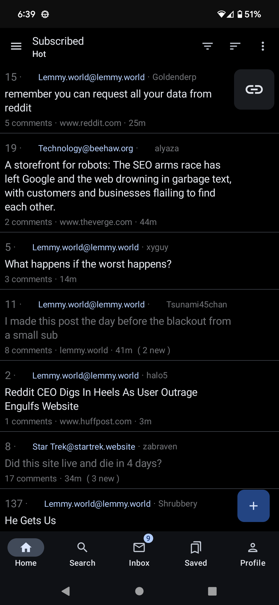
Yeah, I'm also coming from Relay. You may be interested to see the list view rejiggering I just started working on which makes it look a bit more like Relay. Don't know if they'll accept it though. (Ignore the missing thumbnails everywhere, seems to happen in any build I make, even without any changes. Not sure why)

Looks good in my opinion, open a PR when you are finished and let's see if the maintainers like it
I like this better than the current layout! My brain wants the context of the community name before processing the title, so this flows more naturally.
@greed. To easy to tap the wrong bit. On single line posts its the worst
Yup
Yes, all the time. Would love if this can be fixed, as I do prefer list view. It's not even necessary to remove the field entirely (it's useful to see sometimes), but it shouldn't function as a separate link. Same for the community name.
Yes, I always go into someone's account when trying to go into comments.
Same here. I'd move the community link inside too.
Yes, I do.
Since I changed to list view yesterday this happens all the time. I specifically came to this sub to look for this issue, so thank you for addressing it.
Yeah, same here. Keeps happening. I'd love to learn more about coding so I could help contribute to the app and to Lemmy in general. Right now I just have some rudimentary python but some hands on experience would be ideal.